

Em alta

100%


Crie sua conta grátis para liberar esse material. 🤩
Já tem uma conta?
Ao continuar, você aceita os Termos de Uso e Política de Privacidade
Crie sua conta grátis para liberar esse material. 🤩
Já tem uma conta?
Ao continuar, você aceita os Termos de Uso e Política de Privacidade

Crie sua conta grátis para liberar esse material. 🤩
Já tem uma conta?
Ao continuar, você aceita os Termos de Uso e Política de Privacidade
Crie sua conta grátis para liberar esse material. 🤩
Já tem uma conta?
Ao continuar, você aceita os Termos de Uso e Política de Privacidade
Crie sua conta grátis para liberar esse material. 🤩
Já tem uma conta?
Ao continuar, você aceita os Termos de Uso e Política de Privacidade
Crie sua conta grátis para liberar esse material. 🤩
Já tem uma conta?
Ao continuar, você aceita os Termos de Uso e Política de Privacidade
Crie sua conta grátis para liberar esse material. 🤩
Já tem uma conta?
Ao continuar, você aceita os Termos de Uso e Política de Privacidade
Crie sua conta grátis para liberar esse material. 🤩
Já tem uma conta?
Ao continuar, você aceita os Termos de Uso e Política de Privacidade
Crie sua conta grátis para liberar esse material. 🤩
Já tem uma conta?
Ao continuar, você aceita os Termos de Uso e Política de Privacidade
Crie sua conta grátis para liberar esse material. 🤩
Já tem uma conta?
Ao continuar, você aceita os Termos de Uso e Política de Privacidade
Prévia do material em texto
02/03/2016 JavaFX CSS Reference Guide
http://docs.oracle.com/javase/8/javafx/api/javafx/scene/docfiles/cssref.html#introscenegraph 1/30
JavaFX CSS Reference Guide
Contents
Introduction
CSS and the JavaFX Scene Graph
Scene, Parent and SubScene Stylesheets
Naming Conventions
CSS Public API
Inheritance
@ Rules
Examples
Understanding Parser Warnings
Limitations
Types
inherit
<boolean>
<string>
<number> & <integer>
<size>
<length>
<percentage>
<angle>
<duration>
<point>
<colorstop>
<uri>
<effect>
<font>
<paint>
<color>
Stage
javafx.stage
PopupWindow
Nodes
javafx.scene
Group
Node
Parent
Scene
javafx.scene.image
ImageView
javafx.scene.layout
AnchorPane
BorderPane
DialogPane
FlowPane
GridPane
HBox
Pane
Region
StackPane
TilePane
VBox
javafx.scene.media
MediaView
javafx.scene.shape
Shape
Arc
Circle
CubicCurve
Ellipse
Line
Path
Polygon
QuadCurve
Rectangle
SVGPath
javafx.scene.text
Text
javafx.scene.web
WebView
Controls
javafx.scene.control
Accordion
Button
Release: JavaFX 8
02/03/2016 JavaFX CSS Reference Guide
http://docs.oracle.com/javase/8/javafx/api/javafx/scene/docfiles/cssref.html#introscenegraph 2/30
ButtonBase
Cell
CheckBox
CheckMenuItem
ChoiceBox
ColorPicker
ComboBox
ContextMenu
Control
DatePicker
HTMLEditor
Hyperlink
IndexedCell
Label
Labeled
ListCell
ListView
Menu
MenuBar
MenuButton
MenuItem
MenuItemBase
Pagination
PasswordField
ProgressBar
ProgressIndicator
RadioButton
RadioMenuItem
ScrollBar
ScrollPane
Separator
Spinner
Slider
SplitMenuButton
SplitPane
TabPane
TableColumnHeader
TableView
TextArea
TextInputControl
TextField
TitledPane
ToggleButton
ToolBar
Tooltip
TreeCell
TreeTableCell
TreeTableView
TreeView
WebView
Charts
javafx.scene.chart
AreaChart
Axis
BarChart
BubbleChart
CategoryAxis
Chart
Legend
LineChart
NumberAxis
PieChart
ScatterChart
ValueAxis
XYChart
References
Introduction
Never has styling a Java UI been easier than with JavaFX and Cascading Style Sheets (CSS). Going from one theme to another, or customizing the look
of just one control, can all be done through CSS. To the novice, this may be unfamiliar territory; but the learning curve is not that great. Give CSS styling
a try and the benefits will soon be apparent. You can also split the design and development workflow, or defer design until later in the project. Up to the
last minute changes, and even postdeployment changes, in the UI's look can be achieved through JavaFX CSS.
The structure of this document is as follows. First, there is a description of all value types for JavaFX CSS properties.Where appropriate, this includes a
grammar for the syntax of values of that type. Then, for each scene‑graph node that supports CSS styles, a table is given that lists the properties that
are supported, along with type and semantic information. The pseudo‑classes for each class are also given. The description of CSS properties continues
for the controls. For each control, the substructure of that control's skin is given, along with the style‑class names for the Region objects that implement
that substructure.
CSS and the JavaFX Scene Graph
02/03/2016 JavaFX CSS Reference Guide
http://docs.oracle.com/javase/8/javafx/api/javafx/scene/docfiles/cssref.html#introscenegraph 3/30
JavaFX Cascading Style Sheets (CSS) is based on the W3C CSS version 2.1 [1] with some additions from current work on version 3 [2]. JavaFX CSS
also has some extensions to CSS in support of specific JavaFX features. The goal for JavaFX CSS is to allow web developers already familiar with CSS
for HTML to use CSS to customize and develop themes for JavaFX controls and scene‑graph objects in a natural way.
JavaFX has a rich set of extensions to CSS in support of features such as color derivation, property lookup, and multiple background colors and borders
for a single node. These features add significant new power for developers and designers and are described in detail in this document.
To the extent possible, JavaFX CSS follows the W3C standards; however, with few exceptions, JavaFX property names have been prefixed with a
vendor extension of "fx". Even if these properties seem to be compatible with standard HTML CSS, JavaFX CSS processing assumes that the property
values make use of JavaFX CSS extensions.
CSS styles are applied to nodes in the JavaFX scene‑graph in a way similar to the way CSS styles are applied to elements in the HTML DOM. Styles are
first applied to the parent, then to its children. The code is written such that only those branches of the scene‑graph that might need CSS reapplied are
visited. A node is styled after it is added to the scene graph. Styles are reapplied when there is a change to the node's pseudo‑class state, style‑class, id,
inline style, or parent, or stylesheets are added to or removed from the scene. Note that the Node must be in the scene‑graph for CSS to be applied. The
Node does not have to be shown, but must have a non‑null value for its sceneProperty. See applyCss for more details.
During a normal scene‑graph pulse, CSS styles are applied before the scene‑graph is laid out and painted. Styles for events that trigger a pseudo‑class
state change, such as MouseEvent.MOUSE_ENTERED which triggers the "hover" state, are applied on the next pulse following the event.
CSS selectors are used to match styles to scene‑graph nodes. The relationship of a Node to a CSS selector is as follows:
Node's getTypeSelector method returns a String which is analogous to a CSS Type Selector. By default, this method returns the simple name of
the class. Note that the simple name of an inner class or of an anonymous class may not be usable as a type selector. In such a case, this method
should be overridden to return a meaningful value.
Each node in the scene‑graph has a styleClass property. Note that a node may have more than one style‑class. A Node's styleClass is analogous
to the class="..." attribute that can appear on HTML elements. See Class Selectors.
Each node in the scene‑graph has an id variable, a string. This is analogous to the id="..." attribute that can appear HTML elements. See ID
Selectors.
JavaFX CSS also supports pseudo‑classes, but does not implement the full range of pseudo‑classes as specified in Pseudo‑classes. The
pseudo‑classes supported by each Node type are given in the tables within this reference. Note that JavaFX does not currently support structural
pseudo‑classes.
Each node honors a set of properties that depends on the node's JavaFX class (as distinct from its styleClass). The properties honored by each node
class are shown in detail in tables later in this document. The property value that is actually applied depends on the precedence of the origin of the rule,
as described above, as well as the specificity of the rule's selector as described in CSS 2 [1] . Ultimately, a property value string is converted into a
JavaFX value of the appropriate type and is then assigned to an instance variable of the JavaFX object.
Scene, Parent and SubScene Stylesheets
CSS styles can come from style sheets or inline styles. Style sheets are loaded from the URLs specified in the getStylesheets property of the Scene
object. If the scene‑graph contains a Control, a default user agent style sheet is loaded. Inline styles are specified via the Node setStyle API. Inline styles
are analogous to the style="..." attribute of an HTML element. Styles loaded from a Scene's style sheets take precedence over selectors from the user
agent style sheet. Inline styles take precedence over styles originating elsewhere. The precedence order of style selectors can be modified using
"!important" in a style declaration.
Beginning with JavaFX 2.1, the Parent class has a getStylesheets property, allowing style sheets to be set on a container. This allows for one branch of
of thescene‑graph to have a distinct set of styles. Any instance of Parent can have style sheets. A child will take its styles from its own inline styles, the
style sheets of all its ancestors, and any style sheets from the Scene.
Beginning with JavaFX 8u20, the Scene class has a getUserAgentStylesheet property, allowing a user‑style sheet to be set on a Scene. This allows a
Scene to have a set of user‑agent styles distinct from the platform default. When a user‑agent stylesheet is set on a Scene, the user‑agent styles are
used instead of the styles from the platform default user‑agent stylesheet.
Beginning with JavaFX 8u20, the SubScene class has a getUserAgentStylesheet property, allowing a user‑style sheet to be set on a SubScene. This
allows a SubScene of the scene‑graph to have set of user‑agent styles distinct from the platform default or from the Scene in which the SubScene is
contained. When a user‑agent stylesheet is set on a SubScene, the user‑agent styles are used instead of the styles from the platform default user‑agent
stylesheet or any user‑agent stylesheet set on the Scene.
It is important to note that styles from a stylesheet added to a Scene or Parent, do not affect a SubScene which is a child or descendent of the Scene or
Parent. Unless a user‑agent has been set on the SubScene, the SubScene will get styles from the a Scene's user‑agent stylesheet or the platform
user‑agent stylesheet.
The implementation allows designers to style an application by using style sheets to override property values set from code. For example, a call to
rectangle.setFill(Color.YELLOW) can be overridden by an inline‑style or a style from an author stylesheet. This has implications for the cascade;
particularly, when does a style from a style sheet override a value set from code? The JavaFX CSS implementation applies the following order of
precedence: a style from a user agent style sheet has lower priority than a value set from code, which has lower priority than a Scene or Parent style
sheet. Inline styles have highest precedence. Style sheets from a Parent instance are considered to be more specific than those styles from Scene style
sheets.
Naming Conventions
Naming conventions have been established for deriving CSS style‑class names from JavaFX class names, and for deriving CSS property names from
JavaFX variable names. Note that this is only a naming convention; there is no automatic name conversion. Most JavaFX names use "camel case," that
is, mixed case names formed from compound words, where the initial letter of each subword is capitalized. Most CSS names in the HTML world are all
lower case, with compound words separated by hyphens. The convention is therefore to take JavaFX class names and form their corresponding CSS
style‑class name by separating the compound words with hyphens and convering the letters to all lower case. For example, the JavaFX ToggleButton
class would have a style‑class of "togglebutton". The convention for mapping JavaFX variable names to CSS property names is similar, with the addition
of the "fx" prefix. For example, the blendMode variable would have a corresponding CSS property name of "fxblendmode".
02/03/2016 JavaFX CSS Reference Guide
http://docs.oracle.com/javase/8/javafx/api/javafx/scene/docfiles/cssref.html#introscenegraph 4/30
CSS Public API
Beginning with JavaFX 8.0, public API is available for developers to create styleable properties and manage pseudoclass state. Refer to javafx.css for
details.
Inheritance
CSS also provides for certain properties to be inherited by default, or to be inherited if the property value is 'inherit'. If a value is inherited, it is inherited
from the computed value of the element's parent in the document tree. In JavaFX, inheritance is similar, except that instead of elements in the document
tree, inheritance occurs from parent nodes in the scene‑graph.
The following properties inherit by default. Any property can be made to inherit by giving it the value "inherit".
Class Property CSS Property Initial Value
javafx.scene.Node cursor fxcursor javafx.scene.Cursor.DEFAULT
javafx.scene.text.Text textAlignment fxtextalignment javafx.scene.text.TextAlignment.LEFT
javafx.scene.text.Font font fxfont, fxfontfamily, fxfontsize, fxfontweight, fxfontstyle Font.DEFAULT (12px system)
Within the hierarchy of JavaFX classes (for example, Rectangle is a subclass of Shape, which in turn is a subclass of Node), the CSS properties of an
ancestor are also CSS properties of the descendant. This means that a subclass will respond to the same set of properties as its ancestor classes, and
to additional properties it defines itself. So, a Shape supports all the properties of Node plus several more, and Rectangle supports all the properties of
Shape plus a couple more. However, because using a JavaFX class name as a type selector is an exact match, providing style declarations for a Shape
will not cause a Rectangle to use those values (unless the .css value for the Rectangle's property is "inherit").
For font inheritance, the CSS engine looks only for the styles in the table above. When looking for a font to inherit, the search terminates at any node that
has a Font property that was set by the user. The userset font is inherited provided there is not an author or an inlinestyle that applies specifically to
that node. In this case, the inherited font is created from the userset font and any parts of the applicable author or inline style.
@ Rules
Beginning with JavaFX 8u20, the CSS @import is also partially supported. Only unconditional import is supported. In other words, the media‑type
qualifier is not supported. Also, the JavaFX CSS parser is noncompliant with regard to where an @import may appear within a stylesheet (see At‑rules).
Users are cautioned that this will be fixed in a future release. Adherence to the W3C standard is strongly advised.
Since JavaFX 8, the implementation partially supports the CSS3 syntax to load a font from a URL using the @font‑face rule:
@font‐face {
font‐family: 'sample';
font‐style: normal;
font‐weight: normal;
src: local('sample'), url('http://font.samples/resources/sample.ttf';) format('truetype');
}
This allows public resources for fonts to be used in a JavaFX application. For example, assume the URL "http://font.samples/web?family=samples"
returns the @font‑face rule given above. Then the following code shows how the sample font could be used in a JavaFX application.
import javafx.application.Application;
import javafx.scene.Scene;
import javafx.scene.control.Label;
import javafx.stage.Stage;
public class HelloFontFace extends Application {
@Override public void start(Stage primaryStage) {
Label label = new Label("Hello @FontFace");
label.setStyle("‐fx‐font‐family: sample; ‐fx‐font‐size: 80;");
Scene scene = new Scene(label);
scene.getStylesheets().add("http://font.samples/web?family=samples");
primaryStage.setTitle("Hello @FontFace");
primaryStage.setScene(scene);
primaryStage.show();
}
public static void main(String[] args) { launch(args); }
}
Or, the URL could be imported into a stylesheet with the @import rule.
Although the parser will parse the syntax, all @font‑face descriptors are ignored except for the src descriptor. The src descriptor is expected to be a
<url>. The format hint is ignored.
Examples
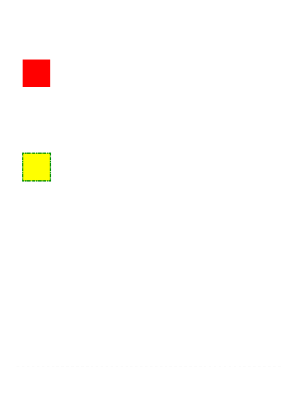
Consider the following simple JavaFX application:
Scene scene = new Scene(new Group());
scene.getStylesheets().add(“test.css”);
Rectangle rect = new Rectangle(100,100);
rect.setLayoutX(50);
02/03/2016 JavaFX CSS Reference Guide
http://docs.oracle.com/javase/8/javafx/api/javafx/scene/docfiles/cssref.html#introscenegraph5/30
rect.setLayoutY(50);
rect.getStyleClass().add("my-rect");
((Group)scene.getRoot()).getChildren().add(rect);
Without any styles, this will display a plain black rectangle. If test.css contains the following:
.my-rect { -fx-fill: red; }
the rectangle will be red instead of black:
If test.css contains the following:
.my-rect {
-fx-fill: yellow;
-fx-stroke: green;
-fx-stroke-width: 5;
-fx-stroke-dash-array: 12 2 4 2;
-fx-stroke-dash-offset: 6;
-fx-stroke-line-cap: butt;
}
the result will be a yellow rectangle with a nicely dashed green border:
Understanding Parser Warnings
When the JavaFX CSS parser encounters a syntax error, a warning message is emitted which conveys as much information as is available to help
resolve the error. For example
WARNING: com.sun.javafx.css.parser.CSSParser declaration Expected '<percent>' while parsing '-fx-background-color'
at ?[1,49]
The cryptic '?[1,49]' pertains to the location of the error. The format of the location string is
<url>[line, position]
If the error is found while parsing a file, the file URL will be given. If the error is from an inline style (as in the example above), the URL is given as a
question mark. The line and position give an offset into the file or string where the token begins. Please note that the line and position may not be
accurate in releases prior to JavaFX 2.2.
Applications needing to detect errors from the parser can add a listener to the errors property of com.sun.javafx.css.StyleManager. This is not public API
and is subject to change.
Limitations
1. While the JavaFX CSS parser will parse valid CSS syntax, it is not a fully compliant CSS parser. One should not expect the parser to handle syntax
not specified in this document.
2. With the exception of @font‑face and @import, @keyword statements are ignored.
3. The <mediaquerylist> of the @import statement is not parsed.
4. The structural pseudo‑classes are not supported.
5. The ":active" and ":focus" dynamic pseudo‑classes are not supported. However, Nodes do support the ":pressed" and ":focused" pseudo‑classes,
which are similar.
6. The ":link" and ":visited" pseudo‑classes are not supported in general. However, Hyperlink objects can be styled, and they support the ":visited"
pseudo‑class.
7. JavaFX CSS does not support commaseparated series of font family names in the fxfontfamily property. The optional line height parameter
when specifying fonts is not supported. There is no equivalent for the fontvariant property.
8. JavaFX CSS uses the HSB color model instead of the HSL color model.
9. If a property of a node is initialized by calling the set method of the property, the CSS implementation will see this as a user set value and the value
will not be overwritten by a style from a user agent style sheet.
10. When parsing a URI, the parser doesn't handle URI escapes nor \<hexdigit>[1,6] code points.
Types
inherit
Each property has a type, which determines what kind of value and the syntax for specifying those values. In addition, each property may have a
specified value of 'inherit', which means that, for a given node, the property takes the same computed value as the property for the node's parent. The
02/03/2016 JavaFX CSS Reference Guide
http://docs.oracle.com/javase/8/javafx/api/javafx/scene/docfiles/cssref.html#introscenegraph 6/30
'inherit' value can be used on properties that are not normally inherited.
If the 'inherit' value is set on the root element, the property is assigned its initial value.
<boolean>
Boolean values can either have the string value of "true" or "false", the values are case insensitive as all CSS is case insensitive.
<string>
Strings can either be written with double quotes or with single quotes. Double quotes cannot occur inside double quotes, unless escaped (e.g., as '\"' or
as '\22'). Analogously for single quotes (e.g., "\'" or "\27").
"this is a 'string'"
"this is a \"string\""
'this is a "string"'
'this is a \'string\''
A string cannot directly contain a newline. To include a newline in a string, use an escape representing the line feed character in ISO10646 (U+000A),
such as "\A" or "\00000a". This character represents the generic notion of "newline" in CSS. See the 'content' property for an example.
<number> & <integer>
Some value types may have integer values (denoted by <integer>) or real number values (denoted by <number>). Real numbers and integers are
specified in decimal notation only. An <integer> consists of one or more digits "0" to "9". A <number> can either be an <integer>, or it can be zero or
more digits followed by a dot (.) followed by one or more digits. Both integers and real numbers may be preceded by a "" or "+" to indicate the sign. 0 is
equivalent to 0 and is not a negative number.
[+|-]? [[0-9]+|[0-9]*"."[0-9]+]
Note that many properties that allow an integer or real number as a value actually restrict the value to some range, often to a nonnegative value.
<size>
A size is a <number> with units of <length> or <percentage>. If units are not specified then specified the 'px' is assumed.
<length>
<number>[ px | mm | cm | in | pt | pc | em | ex ]?
No whitespace is allowed between the number and units if provided. Some units are relative and others absolute.
Relative
px: pixels, relative to the viewing device
em: the 'fontsize' of the relevant font
ex: the 'xheight' of the relevant font
Absolute
in: inches — 1 inch is equal to 2.54 centimeters.
cm: centimeters
mm: millimeters
pt: points — the points used by CSS 2.1 are equal to 1/72nd of an inch.
pc: picas — 1 pica is equal to 12 points.
<percentage>
These are a percentage of some length, typically to the width or height of a node.
<number>[ % ]
<angle>
An angle is a <number> with one of the following units.
<number>[ deg | rad | grad | turn ]
deg: angle in degrees — all other angle units are converted to degrees.
rad: angle in radians
grad: angle in gradians
turn: angle in turns
<duration>
A duration is a <number> with second or millisecond units, or the value indefinite.
[<number>[ s | ms ]] | indefinite
s: duration in seconds
ms: duration in milliseconds. One second is 1000 milliseconds.
indefinite: See Duration.INDEFINITE
See also W3C time units.
<point>
02/03/2016 JavaFX CSS Reference Guide
http://docs.oracle.com/javase/8/javafx/api/javafx/scene/docfiles/cssref.html#introscenegraph 7/30
A point is an {x,y} coordinate.
[ [ <length> <length> ] | [ <percentage> | <percentage> ] ]
<colorstop>
Stops are per W3C color-stop syntax.
[ <color> [ <percentage> | <length>]? ]
In a series of <colorstop>, stop distance values must all be <percentage> or <length>. Furthermore, if <length> values are used, then the distance value
for first and last stop in the series must be specified. This restriction may be removed in a future release.
"red, white 70%, blue" is valid since the distance for red and blue is assumed to be 0% and 100%, respectively.
"red 10, white, blue 90" is valid. Because distance for red and blue is 10 and 90, respectively, the distance for white can be calculated.
"red, white 70, blue" is not valid since distance units do not agree.
"red, white, blue" is valid. The stops are distributed evenly between 0% and 100%.
<uri>
url ( [\"\']? <address> [\"\']? )
<address> is a hierarchical URI of the form [scheme:][//authority][path] (see [2]). For example:
url(http://example.com/images/Duke.png)
url(/com/example/javafx/app/images/Duke.png)
If the <address> does not have a [scheme:] component, the <address> is considered to be the [path] component only. A leading '/' character indicates
that the [path] is relative to the root of the classpath. If the the style appears in a stylesheet and has no leading '/' character, the path is relative to thebase URI of the stylesheet. If the style appears in an inline style, the path is relative to the root of the classpath (regardless of whether or not there is a
leading '/').
Examples of Resolving URLs in Stylesheets
Stylesheet URL URL in Style Resolves to
file:///some/path/build/classes/com/mycompany/myapp/mystyles.css url(images/Duke.png) file:///some/path/build/classes/com/mycompany/myapp/images/Duke.png
file:///some/path/build/classes/com/mycompany/myapp/mystyles.css url(../images/Duke.png) file:///some/path/build/classes/com/mycompany/images/Duke.png
jar:file:/some/path/build/myapp.jar!/com/mycompany/myapp/mystyles.css url(images/Duke.png) jar:file:/some/path/build/myapp.jar!/com/mycompany/myapp/images/Duke.png
Examples of Resolving URLs in Inline Styles
Classpath URL in Style Resolved URL
file:///some/path/build/classes url(/com/mycompany/resources/images/Duke.png) file:///some/path/build/classes/com/mycompany/resources/images/Duke.png
file:///some/path/build/myapp.jar url(/com/mycompany/resources/images/Duke.png) jar:file:/some/path/build/myapp.jar!/com/mycompany/resources/images/Duke.png
Note that for inline styles, leading dotsegments (e.g. '..' or '.') do resolve since the path is always anchored at the root of the classpath.
This snippet of code creates a scene filled with the "paste" image from HTMLEditor which is found in jfxrt.jar.
@Override public void start(Stage stage) {
StackPane root = new StackPane();
root.setStyle("‐fx‐background‐image: url(/com/sun/javafx/scene/control/skin/modena/HTMLEditor‐Paste.png);");
Scene scene = new Scene(root, 300, 250);
stage.setScene(scene);
stage.show();
}
The same style would work equally as well from a stylesheet.
<effect>
JavaFX CSS currently supports the DropShadow and InnerShadow effects from the JavaFX platform. See the class documentation in javafx.scene.effect
for further details about the semantics of the various effect parameters.
Drop Shadow
A highlevel effect that renders a shadow of the given content behind the content.
dropshadow( <blur-type> , <color> , <number> , <number> , <number> , <number> )
<blur-type> = [ gaussian | one-pass-box | three-pass-box | two-pass-box ]
<color> The shadow Color.
<number> The radius of the shadow blur kernel. In the range [0.0 ... 127.0], typical value 10.
<number> The spread of the shadow. The spread is the portion of the radius where the contribution of the source material will be 100%. The
remaining portion of the radius will have a contribution controlled by the blur kernel. A spread of 0.0 will result in a distribution of the shadow
determined entirely by the blur algorithm. A spread of 1.0 will result in a solid growth outward of the source material opacity to the limit of the
radius with a very sharp cutoff to transparency at the radius. Values should be in the range [0.0 ... 1.0].
<number> The shadow offset in the x direction, in pixels.
<number> The shadow offset in the y direction, in pixels.
Inner Shadow
02/03/2016 JavaFX CSS Reference Guide
http://docs.oracle.com/javase/8/javafx/api/javafx/scene/docfiles/cssref.html#introscenegraph 8/30
A highlevel effect that renders a shadow inside the edges of the given content.
innershadow( <blur-type> , <color> , <number> , <number> , <number> , <number> )
<blur-type> = [ gaussian | one-pass-box | three-pass-box | two-pass-box ]
<color> The shadow Color.
<number> The radius of the shadow blur kernel. In the range [0.0 ... 127.0], typical value 10.
<number> The choke of the shadow. The choke is the portion of the radius where the contribution of the source material will be 100%. The
remaining portion of the radius will have a contribution controlled by the blur kernel. A choke of 0.0 will result in a distribution of the shadow
determined entirely by the blur algorithm. A choke of 1.0 will result in a solid growth inward of the shadow from the edges to the limit of the radius
with a very sharp cutoff to transparency inside the radius. Values should be in the range [0.0 ... 1.0].
<number> The shadow offset in the x direction, in pixels.
<number> The shadow offset in the y direction, in pixels.
<font>
JavaFX CSS supports the ability to specify fonts using separate family, size, style, and weight properties, as well as the ability to specify a font using a
single shorthand property. There are four value types related to fonts plus a shorthand property that encompasses all four properties. The fontrelated
types are as follows.
<font-family>The string name of the font family. An actual font family name available on the system can be used, or one of the following generic
family names can be used:
'serif' (e.g., Times)
'sansserif' (e.g., Helvetica)
'cursive' (e.g., ZapfChancery)
'fantasy' (e.g., Western)
'monospace' (e.g., Courier)
<font-size> The size of the font, using the <size> syntax.
<font-style> The font's style, using the following syntax:
[ normal | italic | oblique ]
<font-weight> The font's weight, using the following syntax:
[ normal | bold | bolder | lighter | 100 | 200 | 300 | 400 | 500 | 600 | 700 | 800 | 900 ]
<font> This font shorthand property can be used in place of the above properties. It uses the following syntax:
[[ <font-style> || <font-weight> ]? <font-size> <font-family> ]
Font Properties
Most classes that use text will support the following font properties. In some cases a similar set of properties will be supported but with a different prefix
instead of "fxfont".
CSS Property Values Default Comments
fxfont <font> inherit shorthand property for fontsize, fontfamily, fontweight and fontstyle
fxfontfamily <font-family> inherit
fxfontsize <font-size> inherit
fxfontstyle <font-style> inherit
fxfontweight <font-weight> inherit
<paint>
Paint values can either be a solid color specified in one of the color syntaxes, they can be a linear or radial gradient, or an imagepattern.
<color> | <linear-gradient> | <radial-gradient> | <image-pattern> <repeating-image-pattern>
Linear Gradients <linear-gradient>
linear-gradient( [ [from <point> to <point>] | [ to <side-or-corner>], ]? [ [ repeat | reflect ], ]? <color-stop>[,
<color-stop>]+)
where <side-or-corner> = [left | right] || [top | bottom]
Linear gradient creates a gradient going though all the stop colors along the line between the "from" <point> and the "to" <point>. If the points are
percentages, then they are relative to the size of the area being filled. Percentage and length sizes can not be mixed in a single gradient function.
If neither repeat nor reflect are given, then the CycleMethod defaults "NO_CYCLE".
If neither [from <point> to <point>] nor [ to <sideorcorner> ] are given, then the gradient direction defaults to 'to bottom'.
Stops are per W3C color-stop syntax and are normalized accordingly.
This example will create a gradient from top left to bottom right of the filled area with red at the top left corner and black at the bottom right.
linear-gradient(to bottom right, red, black)
This is equivalent to:
linear-gradient(from 0% 0% to 100% 100%, red 0%, black 100%)
This more complex example will create a 50px high bar at the top with a 3 color gradient with white underneath for the rest of the filled area.
linear-gradient(from 0px 0px to 0px 50px, gray, darkgray 50%, dimgray 99%, white)
The following syntax for linear gradient does not conform to the CSS grammar and is deprecated in JavaFX 2.0. The JavaFX 2.0 CSS parser supports
the syntax but this support may be removed in later releases.
linear (<size>, <size>) to (<size>, <size>) stops [ (<number>,<color>) ]+ [ repeat | reflect ]?
Radial Gradients <radial-gradient>
02/03/2016 JavaFX CSS Reference Guide
http://docs.oracle.com/javase/8/javafx/api/javafx/scene/docfiles/cssref.html#introscenegraph 9/30
radial-gradient([focus-angle <angle>, ]? [ focus-distance <percentage>, ]? [ center <point>, ]? radius [ <length> |
<percentage> ] [ [ repeat | reflect ], ]? <color-stop>[, <color-stop>]+)
Radial gradient creates a gradient going though all the stop colors radiating outward from the center point to the radius. If the center point is not
given, the center defaults to (0,0). Percentage values are relative to the size of the area being filled. Percentage and length sizes can not be mixed in a
single gradient function.
If neither repeat nor reflect are given, then the CycleMethod defaults "NO_CYCLE".
Stops are per W3C color-stop syntax and are normalized accordingly.
Following are examples of the use of radialgradient:
radial-gradient(radius 100%, red, darkgray, black)
radial-gradient(focus-angle 45deg, focus-distance 20%, center 25% 25%, radius 50%, reflect, gray, darkgray 75%,
dimgray)
The following syntax for radial gradient does not conform to the CSS grammar and is deprecated in JavaFX 2.0. The JavaFX 2.0 CSS parser supports
the syntax but this support may be removed in later releases.
radial [focus-angle <number> | <number> ] ]? [ focus-distance <size> ]? [ center <size,size> ]? <size> stops [ (
<number>, <color> ) ]+ [ repeat | reflect ]?
Image Paint <image-pattern>
image-pattern(<string>, [<size>, <size>, <size>, <size>[, <boolean>]?]?)
The parameters, in order, are:
<string> The URL of the image.
<size> The x origin of the anchor rectangle.
<size> The y origin of the anchor rectangle.
<size> The width of the anchor rectangle.
<size> The height of the anchor rectangle.
<boolean> The proportional flag which indicates whether start and end locations are proportional or absolute
For a full explanation of the parameters, refer to the ImagePattern javadoc.
Following are examples of the use of imagepattern:
image-pattern("images/Duke.png")
image-pattern("images/Duke.png", 20%, 20%, 80%, 80%)
image-pattern("images/Duke.png", 20%, 20%, 80%, 80%, true)
image-pattern("images/Duke.png", 20, 20, 80, 80, false)
Related, there is the repeating‐image‐pattern function which is a shorthand for producing tiled image based fills. It is equivalent to
image-pattern("images/Duke.png", 0, 0, imageWidth, imageHeight, false)
repeating-image-pattern(<string>)
The only parameter is the uri of the image. Following is an example of the use of imagepattern:
repeating-image-pattern("com/mycompany/myapp/images/Duke.png")
<color>
<named-color> | <looked-up-color> | <rgb-color> | <hsb-color> | <color-function>
Named Colors <named-color>
CSS supports a bunch of named constant colors. Named colors can be specified with just their unquoted name for example:
.button {
-fx-background-color: red;
}
The named colors that are available in CSS are:
aliceblue = #f0f8ff antiquewhite = #faebd7 aqua = #00ffff aquamarine = #7fffd4
azure = #f0ffff beige = #f5f5dc bisque = #ffe4c4 black = #000000
blanchedalmond =
#ffebcd blue = #0000ff blueviolet = #8a2be2 brown = #a52a2a
burlywood = #deb887 cadetblue = #5f9ea0 chartreuse = #7fff00 chocolate = #d2691e
coral = #ff7f50 cornflowerblue =#6495ed cornsilk = #fff8dc crimson = #dc143c
cyan = #00ffff darkblue = #00008b darkcyan = #008b8b darkgoldenrod =#b8860b
darkgray = #a9a9a9 darkgreen = #006400 darkgrey = #a9a9a9 darkkhaki = #bdb76b
darkmagenta =
#8b008b
darkolivegreen =
#556b2f darkorange = #ff8c00 darkorchid = #9932cc
darkred = #8b0000 darksalmon = #e9967a darkseagreen = #8fbc8f darkslateblue =#483d8b
darkslategray = darkslategrey = #2f4f4f darkturquoise = darkviolet = #9400d3
02/03/2016 JavaFX CSS Reference Guide
http://docs.oracle.com/javase/8/javafx/api/javafx/scene/docfiles/cssref.html#introscenegraph 10/30
#2f4f4f #00ced1
deeppink = #ff1493 deepskyblue = #00bfff dimgray = #696969 dimgrey = #696969
dodgerblue = #1e90ff firebrick = #b22222 floralwhite = #fffaf0 forestgreen = #228b22
fuchsia = #ff00ff gainsboro = #dcdcdc ghostwhite = #f8f8ff gold = #ffd700
goldenrod = #daa520 gray = #808080 green = #008000 greenyellow = #adff2f
grey = #808080 honeydew = #f0fff0 hotpink = #ff69b4 indianred = #cd5c5c
indigo = #4b0082 ivory = #fffff0 khaki = #f0e68c lavender = #e6e6fa
lavenderblush =
#fff0f5 lawngreen = #7cfc00 lemonchiffon = #fffacd lightblue = #add8e6
lightcoral = #f08080 lightcyan = #e0ffff lightgoldenrodyellow =#fafad2 lightgray = #d3d3d3
lightgreen = #90ee90 lightgrey = #d3d3d3 lightpink = #ffb6c1 lightsalmon = #ffa07a
lightseagreen =
#20b2aa lightskyblue = #87cefa
lightslategray =
#778899
lightslategrey =
#778899
lightsteelblue =
#b0c4de lightyellow = #ffffe0 lime = #00ff00 limegreen = #32cd32
linen = #faf0e6 magenta = #ff00ff maroon = #800000 mediumaquamarine =#66cdaa
mediumblue =
#0000cd
mediumorchid =
#ba55d3
mediumpurple =
#9370db
mediumseagreen =
#3cb371
mediumslateblue =
#7b68ee
mediumspringgreen =
#00fa9a
mediumturquoise =
#48d1cc
mediumvioletred =
#c71585
midnightblue =
#191970 mintcream = #f5fffa mistyrose = #ffe4e1 moccasin = #ffe4b5
navajowhite = #ffdead navy = #000080 oldlace = #fdf5e6 olive = #808000
olivedrab = #6b8e23 orange = #ffa500 orangered = #ff4500 orchid = #da70d6
palegoldenrod =
#eee8aa palegreen = #98fb98
paleturquoise =
#afeeee
palevioletred =
#db7093
papayawhip = #ffefd5 peachpuff = #ffdab9 peru = #cd853f pink = #ffc0cb
plum = #dda0dd powderblue = #b0e0e6 purple = #800080 red = #ff0000
rosybrown = #bc8f8f royalblue = #4169e1 saddlebrown =#8b4513 salmon = #fa8072
sandybrown =
#f4a460 seagreen = #2e8b57 seashell = #fff5ee sienna = #a0522d
silver = #c0c0c0 skyblue = #87ceeb slateblue = #6a5acd slategray = #708090
slategrey = #708090 snow = #fffafa springgreen = #00ff7f steelblue = #4682b4
tan = #d2b48c teal = #008080 thistle = #d8bfd8 tomato = #ff6347
turquoise = #40e0d0 violet = #ee82ee wheat = #f5deb3 white = #ffffff
whitesmoke = #f5f5f5 yellow = #ffff00 yellowgreen = #9acd32 transparent =rgba(0,0,0,0)
Lookedup Colors <looked-up-color>
With lookedup colors you can refer to any other color property that is set on the current node or any of its parents. This is a very powerful feature, as it
allows a generic palette of colors to be specified on the scene then used thoughout the application. If you want to change one of those palette colors you
can do so at any level in the scene tree and it will affect that node and all its decendents. Lookedup colors are not looked up until they are applied, so
they are live and react to any style changes that might occur, such as replacing a palette color at runtime with the "style" property on a node.
In the following example, all background color of all buttons uses the looked up color "abc".
.root { abc: #f00 }
.button { -fx-background-color: abc }
RGB Colors <rgb-color>
The RGB color model is used in numerical color specifications. It has a number of different supported forms.
#<digit><digit><digit>
| #<digit><digit><digit><digit><digit><digit>
| rgb( <integer> , <integer> , <integer> )
02/03/2016 JavaFX CSS Reference Guide
http://docs.oracle.com/javase/8/javafx/api/javafx/scene/docfiles/cssref.html#introscenegraph 11/30
| rgb( <integer> %, <integer>% , <integer>% )
| rgba( <integer> , <integer> , <integer> , <number> )
| rgba( <integer>% , <integer>% , <integer> %, <number> )
These examples all specify the same color for the text fill of a Label:
.label { fxtextfill: #f00 } /* #rgb */
.label { fxtextfill: #ff0000 } /* #rrggbb */
.label { fxtextfill: rgb(255,0,0) }
.label { fxtextfill: rgb(100%, 0%, 0%) }
.label { fxtextfill: rgba(255,0,0,1) }
RGB Hex: The format of an RGB value in hexadecimal notation is a ‘#’ immediately followed by either three or six hexadecimal characters. The three
digit RGB notation (#rgb) is converted into sixdigit form (#rrggbb) by replicating digits, not byadding zeros. For example, #fb0 expands to #ffbb00. This
ensures that white (#ffffff) can be specified with the short notation (#fff) and removes any dependencies on the color depth of the display.
RGB Decimal or Percent: The format of an RGB value in the functional notation is ‘rgb(’ followed by a commaseparated list of three numerical values
(either three decimal integer values or three percentage values) followed by ‘)’. The integer value 255 corresponds to 100%, and to F or FF in the
hexadecimal notation: rgb(255,255,255) = rgb(100%,100%,100%) = #FFF. White space characters are allowed around the numerical values.
RGB + Alpha: This is an extension of the RGB color model to include an ‘alpha’ value that specifies the opacity of a color. This is accomplished via a
functional syntax of the form rgba(...) form that takes a fourth parameter which is the alpha value. The alpha value must be a number in the range 0.0
(representing completely transparent) and 1.0 (completely opaque). As with the rgb() function, the red, green, and blue values may be decimal integers
or percentages. The following examples all specify the same color:
.label { fxtextfill: rgb(255,0,0) } /* integer range 0 — 255*/
.label { fxtextfill: rgba(255,0,0,1) /* the same, with explicit opacity of 1 */
.label { fxtextfill: rgb(100%,0%,0%) } /* float range 0.0% — 100.0% */
.label { fxtextfill: rgba(100%,0%,0%,1) } /* the same, with explicit opacity of 1 */
HSB Colors <hsb-color>
Colors can be specified using the HSB (sometimes called HSV) color model, as follows:
hsb( <number> , <number>% , <number>% ) | hsba( <number> , <number>% , <number>% , <number> )
The first number is hue, a number in the range 0 to 360 degrees. The second number is saturation, a percentage in the range 0% to 100%. The third
number is brightness, also a percentage in the range 0% to 100%. The hsba(...) form takes a fourth parameter at the end which is a alpha value in the
range 0.0 to 1.0, specifying completely transparent and completely opaque, respectively.
Color Functions <color-function>
JavaFX supports some color computation functions. These compute new colors from input colors at the time the color style is applied. This enables a
color theme to be specified using a single base color and to have variant colors computed from that base color. There are two color functions: derive()
and ladder().
<derive> | <ladder>
Derive <derive>
derive( <color> , <number>% )
The derive function takes a color and computes a brighter or darker version of that color. The second parameter is the brightness offset, representing
how much brighter or darker the derived color should be. Positive percentages indicate brighter colors and negative percentages indicate darker colors.
A value of 100% means completely black, 0% means no change in brightness, and 100% means completely white.
Ladder<ladder>
ladder(<color> , <color-stop> [, <color-stop>]+)
The ladder function interpolates between colors. The effect is as if a gradient is created using the stops provided, and then the brightness of the provided
<color> is used to index a color value within that gradient. At 0% brightness, the color at the 0.0 end of the gradient is used; at 100% brightness, the
color at the 1.0 end of the gradient is used; and at 50% brightness, the color at 0.5, the midway point of the gradient, is used. Note that no gradient is
actually rendered. This is merely an interpolation function that results in a single color.
Stops are per W3C color-stop syntax and are normalized accordingly.
For example, you could use the following if you want the text color to be black or white depending upon the brightness of the background.
background: white;
-fx-text-fill: ladder(background, white 49%, black 50%);
The resulting fxtextfill value will be black, because the background (white) has a brightness of 100%, and the color at 1.0 on the gradient is black. If we
were to change the background color to black or dark grey, the brightness would be less than 50%, giving an fxtextfill value of white.
The following syntax for ladder does not conform to the CSS grammar and is deprecated in JavaFX 2.0. The JavaFX 2.0 CSS parser supports the syntax
but this support may be removed in later releases.
ladder(<color>) stops [ ( <number> , <color> ) ]+
Stage
javafx.stage
Group
Style class: .root.popup
PopupWindow does not have any properties that can be styled by CSS, but a PopupWindow does have its own Scene. Scene's root gets the .root style
02/03/2016 JavaFX CSS Reference Guide
http://docs.oracle.com/javase/8/javafx/api/javafx/scene/docfiles/cssref.html#introscenegraph 12/30
class by default. If the Scene is the root scene of a PopupWindow, then the .popup styleclass is also added. This allows the root scene of a
PopupWindow to have distinct styles via the CSS rule .root.popup { /* declarations */ }
Nodes
javafx.scene
Group
Style class: empty by default
CSS Property Values Default Comments
Group extends Parent. Group does not add any addtional CSS properties.
Also has all properties of Parent
Node
Style class: empty by default
CSS Property Values Default Range Comments
fxblendmode
[ add | blue | color-burn | color-dodge | darken |
difference | exclusion | green | hard-light | lighten |
multiply | overlay | red | screen | soft-light | src-
atop | src-in | src-out | src-over ]
null
fxcursor
[ null | crosshair | default | hand | move | e-resize |
h-resize | ne-resize | nw-resize | n-resize | se-resize
| sw-resize | s-resize | w-resize | v-resize | text |
wait ] | <url>
null inherits
fxeffect <effect> null
fxfocustraversable <boolean> false The default value for controls is true, although thereare some exceptions. See Controls for details.
fxopacity <number> 1 [0.0 ... 1.0]
Opacity can be thought of conceptually as a
postprocessing operation. Conceptually, after the
node (including its descendants) is rendered into an
RGBA offscreen image, the opacity setting specifies
how to blend the offscreen rendering into the current
composite rendering.
fxrotate <number> 0
This is the angle of the rotation in degrees. Zero
degrees is at 3 o'clock (directly to the right). Angle
values are positive clockwise. Rotation is about the
center.
fxscalex <number> 1 scale about the center
fxscaley <number> 1 scale about the center
fxscalez <number> 1 scale about the center
fxtranslatex <number> 0
fxtranslatey <number> 0
fxtranslatez <number> 0
visibility [ visible | hidden | collapse | inherit ] true (i.e, visible) See W3C visibility property
Pseudoclasses
CSS Pseudoclass Comments
disabled applies when the disabled variable is true
focused applies when the focused variable is true
hover applies when the hover variable is true
pressed applies when the pressed variable is true
showmnemonic apples when the mnemonic affordance (typically an underscore) should be shown.
Parent
Style class: empty by default
CSS Property Values Default Comments
Parent extends Node. Parent does not add any addtional CSS properties.
Also has all properties of Node
Scene
Style class: not applicable
The Scene object has no settable CSS properties, nor does it have any pseudo‑classes. However, the root node of the scene is assigned the style class
"root" (in addition to style classes already assigned to the node). This is useful because the root node of Scene is the root container for all active
scene‑graph nodes. Thus, it can serve as a container for properties that are inherited or looked up.
javafx.scene.image
ImageView
Style class: imageview
CSS Property Values Default Comments
fximage <uri> null Relative URLs are resolved against the URL of the stylesheet.
02/03/2016 JavaFX CSS Reference Guide
http://docs.oracle.com/javase/8/javafx/api/javafx/scene/docfiles/cssref.html#introscenegraph13/30
Also has all properties of Node
javafx.scene.layout
AnchorPane
Style class: empty by default
CSS Property Values Default Comments
AnchorPane extends Pane and does not add any additional CSS properties.
Also has all properties of Pane
BorderPane
Style class: empty by default
CSS Property Values Default Comments
BorderPane extends Pane and does not add any additional CSS properties.
Also has all properties of Pane
DialogPane
Style class: dialogpane
CSS Property Values Default Comments
fxgraphic <uri> null
Also has all properties of Pane
Substructure
headerpanel — BoderPane
graphiccontainer — StackPane
content — Label
buttonbar — ButtonBar
FlowPane
Style class: empty by default
CSS Property Values Default Comments
fxhgap <size> 0
fxvgap <size> 0
fxalignment [ top-left | top-center | top-right | center-left | center | center-right bottom-left | bottom-center | bottom-right| baseline-left | baseline-center | baseline-right ] top-left
fxcolumnhalignment [ left | center | right ] left
fxrowvalignment [ top | center | baseline | bottom ] center
fxorientation [ horizontal | vertical ] horizontal
Also has all properties of Pane
GridPane
Style class: empty by default
CSS Property Values Default Comments
fxhgap <size> 0
fxvgap <size> 0
fxalignment [ top-left | top-center | top-right | center-left | center | center-right bottom-left | bottom-center | bottom-right |baseline-left | baseline-center | baseline-right ] top-left
fxgridlinesvisible <boolean> false
Also has all properties of Pane
HBox
Style class: empty by default
CSS Property Values Default Comments
fxspacing <size> 0
fxalignment [ top-left | top-center | top-right | center-left | center | center-right bottom-left | bottom-center | bottom-right | baseline-left | baseline-center | baseline-right ] top-left
fxfillheight <boolean> true
Also has all properties of Pane
Pane
Style class: empty by default
CSS Property Values Default Comments
Pane extends Region to expose Region's children. Pane does not add any addtional CSS properties.
Also has all properties of Region
Region
02/03/2016 JavaFX CSS Reference Guide
http://docs.oracle.com/javase/8/javafx/api/javafx/scene/docfiles/cssref.html#introscenegraph 14/30
Style class: empty by default
A Region is a Node (extending from Parent) with backgrounds and borders that are styleable via CSS. A Region is typically a rounded rectangle, though
this can be modified through CSS to be an arbitrary shape. Regions can contain other Region objects (subregions) or they can contain subcontrols. All
Regions have the same set of CSS properties as described below.
Each Region consists of several layers, painted from bottom to top, in this order:
1. background fills
2. background images
3. border strokes
4. border images
5. contents
The background and border mechanisms are patterned after the CSS 3 draft backgrounds and borders module. See [4] for a detailed description.
Background fills are specified with the properties fxbackgroundcolor, fxbackgroundradius and fxbackgroundinsets. The fxbackground
color property is a series of one or more commaseparated <paint> values. The number of values in the series determines the number of background
rectangles that are painted. Background rectangles are painted in the order specified using the given <paint> value. Each background rectangle can
have different radii and insets. The fxbackgroundradius and fxbackgroundinsets properties are series of commaseparated values (or sets of
values). The radius and insets values used for a particular background are the found in the corresponding position in the fxbackgroundradius and fx
backgroundinsets series. For example, suppose a series of three values is given for the fxbackgroundcolor property. A series of three values should
also be specified for the fxbackgroundradius and fxbackgroundinsets properties. The first background will be painted using the first radius value and
first insets value, the second background will be painted with the second radius value and second insets value, and so forth.
Note also that properties such as fxbackgroundradius and fxbackgroundinsets can contain a series of values or sets of four values. A set of values is
separated by whitespace, whereas the values or setsofvalues in a series are separated by commas. For fxbackgroundradius, a single value indicates
that the value should be used for the radius of all four corners of the background rectangle. A set of four values indicates that different radius values are
to be used for the topleft, topright, bottomright, and bottomleft corners, in that order. Similarly, the fxbackgroundinsets property can also contain a
series of values or sets of values. A set of four values for fxbackgroundinsets indicates that different insets are to be used for the top, right, bottom,
and left edges of the rectangle, in that order.
Background images are specified with the properties fxbackgroundimage, fxbackgroundrepeat, fxbackgroundposition and
fxbackgroundsize. The number of images in the series of fxbackgroundimage values determines the number of background images that are
painted. The fxbackgroundrepeat, fxbackgroundposition, and fxbackgroundsize properties each can contain a series of values. For each item in
the fxbackgroundimage series, the corresponding items in the fxbackgroundrepeat, fxbackgroundposition, and fxbackgroundsize properties are
applied to that background image.
Stroked borders are specified with the properties fxbordercolor, fxborderstyle, fxborderwidth, fxborderradius and fxborderinsets. Each
property contains a series of items. The maximum number of items in the fx bordercolor or fxborderstyle property determines the number of border
layers that are painted.. Each border in the series is painted using information from the corresponding series item of the fxbordercolor, fxborder
style, fxborderwidth, fxborderradius, and fxborderinsets properties. If there is no fxbordercolor, the default color is black. if there is no fx
borderstyle, the default style is solid.
Image borders are specified with the properties fxborderimagesource, fxborderimagerepeat, fxborderimageslice, fxborderimagewidth
and fxborderimageinsets. Each property contains a series of items. The number of items in the fxborderimagesource property determines the
number of images that are painted. Each image in the series is painted using information from the corresponding series items of the fxborderimage
repeat, fxborderimageslice, fxborderimagewidth, and fxborderimageinsets properties.
The region's contents are a sequence of nodes, like any other container. The contents are set programmatically and cannot be set via CSS.
CSS Property Values Default Comments
BACKGROUND FILLS (see CSS Backgrounds and Borders Module Level 3: Backgrounds)
fxregionbackground javafx.scene.layout.Background null
This cannot be set directly from CSS but is created from the property values of
fxbackgroundcolor, fxbackgroundimage, fxbackgroundinsets, fx
backgroundposition, fxbackgroundradius, fxbackgroundrepeat, fx
backgroundsize
fxbackgroundcolor <paint> [ , <paint> ]* transparent A series of paint values separated by commas.
fxbackgroundinsets
<size> | <size> <size> <size>
<size> [ , [ <size> | <size>
<size> <size> <size>] ]*
0 0 0 0
A series of size values or sets of four size values, separated by commas. A
single size value means all insets are the same. Otherwise, the four values for
each inset are given in the order top, right, bottom, left. Each commaseparated
value or set of values in the series appliesto the corresponding background
color.
fxbackgroundradius
[<size>]{1,4} [ / [<size>]
{1,4} ]? [ , [<size>]{1,4} [ /
[<size>]{1,4} ]? ]*
0 0 0 0
The same syntax and semenatics as CSS Backgrounds and Borders Module
Level 3: Curve Radii applies to fxbackgroundradius. Note that JavaFX
supports only the shorthand syntax.
Each commaseparated value or set of values in the series applies to the
corresponding background color.
BACKGROUND IMAGES (see CSS Backgrounds and Borders Module Level 3: Background Image)
fxbackgroundimage <uri> [ , <uri> ]* null A series of image URIs separated by commas.
fxbackgroundposition
<bg-position> [ , <bg-
position> ]*
where <bg-position> = [
[ [ <size> | left | center
| right ] [ <size> | top |
center | bottom ]? ]
| [ [ center | [ left |
right ] <size>? ] || [ center
| [ top | bottom ] <size>? ]
]
0% 0%
A series of <bgposition> values separated by commas. Each bgposition item
in the series applies to the corresponding image in the backgroundimage
series.
fxbackgroundrepeat
<repeat-style> [ , <repeat-
style> ]*
where <repeat-style> = repeat-
x | repeat-y | [repeat | space
| round | stretch | no-repeat]
{1,2}
repeat repeat
A series of <repeatstyle> values separated by commas. Each repeatstyle item
in the series applies to the corresponding image in the backgroundimage
series.
fxbackgroundsize
<bg-size> [ , <bg-size> ]*
<bg-size> = [ <size> | auto ]
{1,2} | cover | contain |
stretch
auto auto A series of <bgsize> values separated by commas. Each bgsize item in theseries applies to the corresponding image in the backgroundimage series.
STROKED BORDERS (see CSS Backgrounds and Borders Module Level 3: Borders)
BORDER IMAGES (see CSS Backgrounds and Borders Module Level 3: Border Images)
fxregionborder javafx.scene.layout.Border null
This cannot be set directly from CSS but is created from the property values of
fxbordercolor, fxborderinsets, fxborderradius, fxborderstyle, fxborder
width, fxborderimageinsets, fxborderimagerepeat, fxborderimageslice,
fxborderimagesource, fxborderimagewidth
A series of paint values or sets of four paint values, separated by commas. For
02/03/2016 JavaFX CSS Reference Guide
http://docs.oracle.com/javase/8/javafx/api/javafx/scene/docfiles/cssref.html#introscenegraph 15/30
fxbordercolor
<paint> | <paint> <paint>
<paint> <paint> [ , [<paint> |
<paint> <paint> <paint>
<paint>] ]*
null
A series of paint values or sets of four paint values, separated by commas. For
each item in the series, if a single paint value is specified, then that paint is used
as the border for all sides of the region; and if a set of four paints is specified,
they are used for the top, right, bottom, and left borders of the region, in that
order. If the border is not rectangular, only the first paint value in the set is used.
fxborderinsets
<size> | <size> <size> <size>
<size> [ , [ <size> | <size>
<size> <size> <size>] ]*
null
A series of inset or sets of four inset values, separated by commas. For each
item in the series, a single inset value means that all insets are the same; and if
a set of four inset values is specified, they are used for the top, right, bottom, and
left edges of the region, in that order. Each item in the series of insets applies to
the corresponding item in the series of border colors.
fxborderradius
[<size>]{1,4} [ / [<size>]
{1,4} ]? [ , [<size>]{1,4} [ /
[<size>]{1,4} ]? ]*
null
Refer to CSS Backgrounds and Borders Module Level 3: Curve Radii. JavaFX
supports only the shorthand syntax.
Each commaseparated value or set of values in the series applies to the
corresponding border color.
fxborderstyle
<border-style> [ , <border-
style> ]*
where <border-style> = <dash-
style> [phase <number>]?
[centered | inside | outside]?
[line-join [miter <number> |
bevel | round]]? [line-cap
[square | butt | round]]?
where <dash-style> = [ none |
solid | dotted | dashed |
segments( <number>, <number>
[, <number>]*) ]
null
A series of border style values, separated by commas. Each item in the series
applies to the corresponding item in the series of border colors.
The segments dashstyle defines a sequence representing the lengths of the
dash segments. Alternate entries in the sequence represent the lengths of the
opaque and transparent segments of the dashes. This corresponds to the
strokeDashArray variable of Shape.
The optional phase parameter defines the point in the dashing pattern that will
correspond to the beginning of the stroke. This corresponds to the
strokeDashOffset variable of Shape.
fxborderwidth
<size> | <size> <size> <size>
<size> [ , [ <size> | <size>
<size> <size> <size>] ]*
null
A series of width or sets of four width values, separated by commas. For each
item in the series, a single width value means that all border widths are the
same; and if a set of four width values is specified, they are used for the top,
right, bottom, and left border widths, in that order. If the border is not rectangular,
only the first width value is used. Each item in the series of widths applies to the
corresponding item in the series of border colors.
fxborderimagesource <uri> [ , <uri> ]* null A series of image URIs, separated by commas.
fxborderimageinsets
<size> | <size> <size> <size>
<size> [ , [ <size> | <size>
<size> <size> <size>] ]*
0 0 0 0
A series of inset or sets of four inset values, separated by commas. For each
item in the series, a single inset value means that all insets are the same; and if
a set of four inset values is specified, they are used for the top, right, bottom, and
left edges of the region, in that order. Each item in the series of insets applies to
the corresponding image in the series of border images.
fxborderimagerepeat
<repeat-style> [ , <repeat-
style> ]*
where <repeat-style> = repeat-
x | repeat-y | [repeat | space
| round | no-repeat]{1,2}
repeat repeat A series of repeatstyle values, separated by commas. Each item in the seriesapplies to the corresponding image in the series of border images.
fxborderimageslice
[<size> | <size> <size> <size>
<size> ] fill? [ , [ <size> |
<size> <size> <size> <size>
<size> ] fill? ]*
100%
A series of image slice values or sets of four values, separated by commas.
Each item in the series applies to the corresponding image in the series of
border images. For each item in the series, if four values are given, they specify
the size of the top, right, bottom, and left slices. This effectively divides the image
into nine regions: an upper left corner, a top edge, an upper right corner, a right
edge, a lower right corner, a bottom edge, a lower left corner, a left edge and a
middle. If one value is specified, this value is used for the slice values for all four
edges. If 'fill' is present, the middle slice is preserved, otherwise it is discarded.
Percentage values may be used here, in which case the values are considered
proportional to the source image.
fxborderimagewidth
<size> | <size> <size> <size>
<size> [ , [ <size> | <size>
<size> <size> <size>] ]*
1 1 1 1
A series of width or sets of four width values, separated by commas. For each
item in the series, a single width value means that all border widths are the
same; and if a set of four width values is specified, they are used for the top,
right, bottom, and left border widths, in that order. If the border is not rectangular,
only the first width value is used. Each item in the series of widths applies to the
corresponding item in the series of border images. Percentage values may be
used here, in which case the values are considered proportional to the border
image area.
OTHER
fxpadding <size> | <size> <size> <size><size> 0 0 0 0
A sets of four padding values,separated by commas. For each item in the
series, a single padding value means that all padding are the same; and if a set
of four padding values is specified, they are used for the top, right, bottom, and
left edges of the region, in that order.
fxpositionshape <boolean> true
If true means the shape centered within the region's width and height, otherwise
the shape is positioned at its source position. Has no effect if a shape string is
not specified.
fxscaleshape <boolean> true
If true means the shape is scaled to fit the size of the region, otherwise the
shape is at its source size, and its position depends on the value of the position
shape property. Has no effect if a shape string is not specified.
fxshape "<string>" null
An SVG path string. By specifying a shape here the region takes on that shape
instead of a rectangle or rounded rectangle. The syntax of this path string is
specified in [3].
fxsnaptopixel <boolean> true Defines whether this region rounds position/spacing and ceils size values topixel boundaries when laying out its children.
fxregionbackground null
This property is set by specifying fxbackgroundcolor and/or fxbackground
image. Optionally, the properties fxbackgroundinsets, fxbackgroundradius,
fxbackgroundposition, fxbackgroundrepeat, and fxbackgroundsize may
also be set. In order to set the Region background to null, specify the style "fx
backgroundcolor: null; fxbackgroundimage: null;". There is no shorthand
notation for fxregionbackground at this time.
fxregionborder null
This property is set by specifying fxbordercolor and/or fxborderimage.
Optionally fxborderinsets, fxborderradius, fxborderstyle, fxborderwidth,
fxborderimageinsets, fxborderimagerepeat, fxborderimageslice and fx
borderimagewidth may be specified. In order to set the Region background to
null, specify the style "fxbordercolor: null; fxborderimage: null;". There is no
shorthand notation for fxregionborder at this time.
fxminheight, fxprefheight, fxmaxheight <number> -1 Percentage values are not useful since the actual value would be computedfrom the width and/or height of the Regions's parent before the parent is laid out.
fxminwidth, fxprefwidth, fxmaxwidth <number> -1 Percentage values are not useful since the actual value would be computedfrom the width and/or height of the Region's parent before the parent is laid out.
Also has all properties of Parent
02/03/2016 JavaFX CSS Reference Guide
http://docs.oracle.com/javase/8/javafx/api/javafx/scene/docfiles/cssref.html#introscenegraph 16/30
StackPane
Style class: empty by default
CSS Property Values Default Comments
fxalignment [ top-left | top-center | top-right | center-left | center | center-right bottom-left | bottom-center | bottom-right | baseline-left | baseline-center | baseline-right ] top-left
Also has all properties of Pane
TilePane
Style class: empty by default
CSS Property Values Default Comments
fxorientation [ horizontal | vertical ] horizontal
fxprefrows <integer> 5
fxprefcolumns <integer> 5
fxpreftilewidth <size> -1
fxpreftileheight <size> -1
fxhgap <size> 0
fxvgap <size> 0
fxalignment [ top-left | top-center | top-right | center-left | center | center-right bottom-left | bottom-center | bottom-right |baseline-left | baseline-center | baseline-right ] top-left
fxtilealignment [ top-left | top-center | top-right | center-left | center | center-right bottom-left | bottom-center | bottom-right |baseline-left | baseline-center | baseline-right ] center
Also has all properties of Pane
VBox
Style class: empty by default
CSS Property Values Default Comments
fxspacing <size> 0
fxalignment [ top-left | top-center | top-right | center-left | center | center-right bottom-left | bottom-center | bottom-right | baseline-left | baseline-center | baseline-right ] top-left
fxfillwidth <boolean> true
Also has all properties of Pane
javafx.scene.media
MediaView
Style class: mediaview
javafx.scene.shape
Shape
Style class: empty by default
CSS Property Values Default Comments
fxfill <paint> BLACK
fxsmooth <boolean> true
fxstroke <paint> null
fxstroketype [ inside | outside | centered ] centered
fxstrokedasharray <size>[ <size>]+ see comment The initial value is that of an empty array, effectively a solid line.
fxstrokedashoffset <number> 0
fxstrokelinecap [ square | butt | round ] square
fxstrokelinejoin [ miter | bevel | round ] miter
fxstrokemiterlimit <number> 10
fxstrokewidth <size> 1
Also has all properties of Node
Arc
Style class: empty by default
The Arc node has all the properties of Shape and Node.
Circle
Style class: empty by default
The Circle node has all the properties of Shape and Node.
CubicCurve
Style class: empty by default
The CubicCurve node has all the properties of Shape and Node.
Ellipse
Style class: empty by default
02/03/2016 JavaFX CSS Reference Guide
http://docs.oracle.com/javase/8/javafx/api/javafx/scene/docfiles/cssref.html#introscenegraph 17/30
The Ellipse node has all the properties of Shape and Node.
Line
Style class: empty by default
CSS Property Values Default Comments
fxfill <paint> null
fxstroke <paint> black
Also has all properties of Shape
Path
Style class: empty by default
CSS Property Values Default Comments
fxfill <paint> null
fxstroke <paint> black
Also has all properties of Shape
Polygon
Style class: empty by default
The Polygon node has all the properties of Shape and Node.
QuadCurve
Style class: empty by default
The QuadCurve node has all the properties of Shape and Node.
Rectangle
Style class: empty by default
CSS Property Values Default Comments
fxarcheight <size> 0
fxarcwidth <size> 0
Also has all properties of Shape
SVGPath
Style class: empty by default
The SVGPath node has all the properties of Shape and Node.
javafx.scene.text
Text
Style class: empty by default
CSS Property Values Default Comments
fxfont <font> Font.DEFAULT inherits
fxfontsmoothingtype [ gray | lcd ] gray
fxstrikethrough <boolean> false
fxtextalignment [ left | center | right | justify ] left inherits
fxtextorigin [ baseline | top | bottom ] baseline
fxunderline <boolean> false
Also has font properties and all properties of Shape
javafx.scene.web
WebView
Style class: webview
CSS Property Values Default Comments
fxcontextmenuenabled <boolean> true
fxfontsmoothingtype [ gray | lcd ] lcd
fxfontscale <number> 1
fxminwidth <size> 0
fxminheight <size> 0
fxprefwidth <size> 800
fxprefheight <size> 600
fxmaxwidth <size> Double.MAX_VALUE
fxmaxheight <size> Double.MAX_VALUE
Also has all properties of Parent
javafx.scene.control
02/03/2016 JavaFX CSS Reference Guide
http://docs.oracle.com/javase/8/javafx/api/javafx/scene/docfiles/cssref.html#introscenegraph 18/30
Since JavaFX 2.0, the default skins for all controls support styling from CSS. This is accomplished by building the skins from layout objects called
Regions. Most of the style properties for a control are provided by the Region objects that comprise the control's skin. Each Region object of the skin's
substructure has its own style‑class so that it can be styled specifically. The control itself will sometimes provide CSS properties in addition to those
provided by its Regions. Finally, controls may also define pseudo‑classes such as "vertical" and "horizontal" in addition to those defined by Node.
With the following exceptions, controls are focus traversable. This means that Control sets the initial value of the focusTraversable propertytrue;
whereas in Node, the initial value of the focusTraversable property is false. The following controls are not focus traversable by default: Accordion, Cell,
Label, MenuBar, ProgressBar, ProgressIndicator, ScrollBar, ScrollPane, Separator, SplitPane, ToolBar.
Accordion
Style class: accordion
The Accordion control has all the properties and pseudo‑classes of Control
Substructure
firsttitledpane — the first TitledPane
Button
Style class: button
The Button control has all the properties of ButtonBase
Pseudoclasses
CSS Pseudoclass Comments
cancel applies if this Button receives VK_ESC if the event is not otherwise consumed
default applies if this Button receives VK_ENTER if the event is not otherwise consumed
Also has all pseudo‑classes of ButtonBase
ButtonBase
The ButtonBase control has all the properties of Labeled
Pseudoclasses
CSS Pseudoclass Comments
armed applies when the armed variable is true
Also has all pseudo‑classes of Labeled
Cell
Style class: cell
CSS Property Values Default Comments
fxcellsize <size> 24 The cell size. For vertical ListView or a TreeView or TableView this is the height, for a horizontal ListView this is the width.
The Cell control has all the properties of Labeled
Pseudoclasses
CSS Pseudoclass Comments
empty applies when the empty variable is true
filled applies when the empty variable is false
selected applies when the selected variable is true
Also has all pseudo‑classes of Labeled
Substructure
text — a Labeled
CheckBox
Style class: checkbox
The CheckBox control has all the properties of ButtonBase
Pseudoclasses
CSS Pseudoclass Comments
selected applies when the selected variable is true
determinate applies when the indeterminate variable is false
indeterminate applies when the indeterminate variable is true
Also has all pseudo‑classes of ButtonBase
Substructure
box — a StackPane
mark — a StackPane
CheckMenuItem
02/03/2016 JavaFX CSS Reference Guide
http://docs.oracle.com/javase/8/javafx/api/javafx/scene/docfiles/cssref.html#introscenegraph 19/30
Pseudoclasses
CSS Pseudoclass Comments
selected applies if this item is selected
ChoiceBox
Style class: choicebox
The ChoiceBox control has all the properties and pseudo‑classes of Control
Substructure
openbutton — Region
arrow — Region
ColorPicker
Style class: colorpicker
The ColorPicker control has all the properties and pseudo‑classes of ComboBoxBase
CSS Property Values Default Comments
fxcolorlabelvisible <boolean> true
Also has all properties of Control
Substructure
color display node — Label
arrowbutton — StackPane
arrow — StackPane
ComboBox
Style class: combobox
The ComboBox control has all the properties and pseudo‑classes of ComboBoxBase
Substructure
listcell — a ListCell instance used to show the selection in the button area of a noneditable ComboBox
textinput — a TextField instance used to show the selection and allow input in the button area of an editable ComboBox
comboboxpopup — a PopupControl that is displayed when the button is pressed
listview — a ListView
listcell — a ListCell
ComboBoxBase
Style class: comboboxbase
The ComboBoxBase control has all the properties of Control
Substructure
arrowbutton — a StackPane
arrow — a StackPane
CSS Pseudoclass Comments
editable applies when the editable variable is true
showing applies when the showing variable is true
armed applies when the armed variable is true
ContextMenu
Style class: contextmenu
The ContextMenu class has all the properties of PopupControl.
The selector for a ContextMenu may be made more specific by using the selector for the control from which the ContextMenu was shown. For example,
.choice-box > .context-menu { ... }
Substructure
contextmenu — a Region
scrollarrow — a StackPane
menuuparrow — a StackPane
scrollarrow — a StackPane
menudownarrow — a StackPane
* — a VBox
menuitem — a Region
label — a Label
leftcontainer — a StackPane (for radio buttons and check boxes)
rightcontainer — a StackPane (for pullright menus)
arrow — a Region
graphiccontainer — a StackPane (for MenuItem graphic)
Control
02/03/2016 JavaFX CSS Reference Guide
http://docs.oracle.com/javase/8/javafx/api/javafx/scene/docfiles/cssref.html#introscenegraph 20/30
The Control class has all the properties of Region
CSS Property Values Default Comments
fxskin <string> null The class name of the Control's Skin.
fxfocustraversable <boolean> true
Control sets the default value of the focusTraversable property to true. The default value of the focusTraversable property for the
following controls is false: Accordion, Cell, Label, MenuBar, ProgressBar, ProgressIndicator, ScrollBar, ScrollPane, Separator,
SplitPane, ToolBar.
DatePicker
Style class: datepicker
The DatePicker control has all the properties and pseudo‑classes of ComboBoxBase
CSS Property Values Default Comments
fxshowweeknumbers <boolean> true if the resource bundle property "DatePicker.showWeekNumbers" contains the country code.
Also has all properties of Control
Substructure
datepickerdisplaynode — TextField
HTMLEditor
Style class: htmleditor
The Hyperlink control has all the properties of Control.
Substructure
grid — GridPane (contains WebView)
toptoolbar — ToolBar
htmleditorcut — ToggleButton
htmleditorcopy — ToggleButton
htmleditorpaste — ToggleButton
htmleditoralignleft — ToggleButton
htmleditoralignright — ToggleButton
htmleditoraligncenter — ToggleButton
htmleditoralignjustify — ToggleButton
htmleditoroutdent — ToggleButton
htmleditorindent — ToggleButton
htmleditorbullets — ToggleButton
htmleditornumbers — ToggleButton
webview — WebView
bottomtoolbar — ToolBar
formatmenubutton — ComboBox
fontfamilymenubutton — ComboBox
fontsizemenubutton — ComboBox
htmleditorbold — ToggleButton
htmleditoritalic — ToggleButton
htmleditorunderline — ToggleButton
htmleditorstrike — ToggleButton
htmleditorhr — ToggleButton
htmleditorforeground — ColorPicker
htmleditorbackground — ColorPicker
Hyperlink
Style class: hyperlink
The Hyperlink control has all the properties of ButtonBase.
CSS Property Values Default Comments
fxcursor [ null | crosshair | default | hand | move | e-resize | h-resize | ne-resize | nw-resize | n-resize | se-resize | sw-resize | s-resize | w-resize | v-resize | text | wait ] | <url> hand inherits
Pseudoclasses
CSS Pseudoclass Comments
visited applies when the visited variable is true
Also has all pseudo‑classes of ButtonBase
Substructure
label — Label
IndexedCell
Style class: indexedcell
The IndexedCell control has all the properties of Cell.
Pseudoclasses
CSS Pseudoclass Comments
even applies if this cell's index is even
odd applies if this cell's index is odd
02/03/2016 JavaFX CSS Reference Guide
http://docs.oracle.com/javase/8/javafx/api/javafx/scene/docfiles/cssref.html#introscenegraph 21/30
Also has all pseudo‑classes of Cell
Label
Style class: label
Label has all the properties and pseudo‑class state of Labeled
Labeled
CSS Property Values Default Comments
fxalignment [ top-left | top-center | top-right | center-left | center | center-right bottom-left | bottom-center | bottom-right | baseline-left | baseline-center | baseline-right ] center-left
fxtextalignment [ left | center | right | justify ] left textalign from CSS spec mapsto textAlignment in JavaFX
fxtextoverrun [ center-ellipsis | center-word-ellipsis | clip | ellipsis | leading-ellipsis | leading-word-ellipsis | word-ellipsis ] ellipsis
fxwraptext <boolean> false
fxfont <font> platformdependent
inherits
The initial value is that of
Font.getDefault()
fxunderline <boolean>false
fxgraphic <uri> null
fxcontentdisplay [ top | right | bottom | left | center | right | graphic-only | text-only ] left
fxgraphictextgap <size> 4
fxlabelpadding <size> | <size> <size> <size> <size> [0,0,0,0]
fxtextfill <paint> black
fxellipsisstring <string> ...
Also has properties of Control
ListCell
Style class: listcell
The ListCell control has all the settable properties and pseudo‑classes of IndexedCell.
ListView
Style class: listview
CSS Property Values Default Comments
fxorientation [ horizontal | vertical ] vertical
Pseudoclasses
CSS Pseudoclass Comments
horizontal applies if this ListView is horizontal
vertical applies if this ListView is vertical
Substructure
.listview — the ListView<T>
.virtualflow — VirtualFlow
.clippedcontainer — Region
.sheet — Group
.cell.indexedcell.listcell — ListCell<T>
.scrollbar — ScrollBar
Menu
Style class: menu
Pseudoclasses
CSS Pseudoclass Comments
showing applies if this Menu is showing
Also has all pseudo‑classes of Control
MenuBar
Style class: menubar
CSS Property Values Default Comments
fxusesystemmenubar <boolean> false
Also has all properties of Control
MenuBar has all the pseudo‑class states of Control
Substructure
menu
MenuButton
Style class: menubutton
02/03/2016 JavaFX CSS Reference Guide
http://docs.oracle.com/javase/8/javafx/api/javafx/scene/docfiles/cssref.html#introscenegraph 22/30
The MenuButton control has all the properties of ButtonBase
Pseudoclasses
CSS Pseudoclass Comments
openvertically applies if the openVertically variable is true
showing applies if the showing variable is true
Also has all pseudo‑classes of Node
MenuItem
Style class: menuitem
Pagination
Style class: pagination
Pagination has all the pseudo‑class states of Control
CSS Property Values Default Comments
fxmaxpageindicatorcount <number> 10
fxarrowsvisible <boolean> true
fxtooltipvisible <boolean> false
When set to true, a tooltip which shows the page number is set on the page indicators. This property controls whether or
not the tooltip is visible on the page indicators and does not affect the visibility of the tooltip set or installed on the
Pagination control itself.
fxpageinformationvisible <boolean> true
fxpageinformationalignment
[ top | bottom
| left | right
]
bottom
Also has all properties of Control
Substructure
page — StackPane
paginationcontrol — StackPane
leftArrowButton — Button
leftArrow — StackPane
rightArrowButton — Button
rightArrow — StackPane
bulletbutton — ToggleButton
numberbutton — ToogleButton
pageinformation — Label
PasswordField
Style class: passwordfield
The PasswordField control has all the properties of TextField
PopupControl
PopupControl is also a PopupWindow and as such, its root node has the styleclass .root.popup
ProgressBar
Style class: progressbar
CSS Property Values Default Comments
fxindeterminatebarlength <number> 60
fxindeterminatebarescape <boolean> true
fxindeterminatebarflip <boolean> true
fxindeterminatebaranimationtime <number> 2.0
Also has all properties of Control
Pseudoclasses
CSS Pseudoclass Comments
determinate applies if the indeterminate variable is false
indetermindate applies if the indeterminate variable is true
Also has all pseudo‑classes of Control
Substructure
track — StackPane
bar — Region
ProgressIndicator
Style class: progressindicator
CSS Property Values Default Comments
fxindeterminatesegmentcount <number> 8
fxprogresscolor <paint> null
fxspinenabled <boolean> false
Also has all properties of Control
02/03/2016 JavaFX CSS Reference Guide
http://docs.oracle.com/javase/8/javafx/api/javafx/scene/docfiles/cssref.html#introscenegraph 23/30
Pseudoclasses
CSS Pseudoclass Comments
determinate applies if the indeterminate variable is false
indetermindate applies if the indeterminate variable is true
Also has all pseudo‑classes of Control
Substructure
indicator — StackPane
progress — StackPane
percentage — Text
tick — StackPane
RadioButton
Style class: radiobutton
The RadioButton control has all the properties of ToggleButton
Substructure
radio — Region
dot — Region
label — Label
RadioMenuItem
Pseudoclasses
CSS Pseudoclass Comments
selected applies if this item is selected
ScrollBar
Style class: scrollbar
CSS Property Values Default Comments
fxorientation [ horizontal | vertical ] horizontal
fxblockincrement <number> 10
fxunitincrement <number> 1
Pseudoclasses
CSS Pseudoclass Comments
vertical applies if this ScrollBar is vertical
horizontal applies if this ScrollBar is horizontal
Also has all pseudo‑classes of Control
Substructure
decrementbutton — StackPane
decrementarrow — StackPane
track — StackPane
thumb — StackPane
incrementbutton — StackPane
incrementarrow — StackPane
ScrollPane
Style class: scrollpane
CSS Property Values Default Comments
fxfittowidth <boolean> false
fxfittoheight <boolean> false
fxpannable <boolean> false
fxhbarpolicy [ never | always | as-needed ] asneeded
fxvbarpolicy [ never | always | as-needed ] asneeded
Also has all properties of Control
Pseudoclasses
CSS Pseudoclass Comments
pannable applies if this ScrollPane is pannable
fitToWidth applies if this ScrollPane is fitToWidth
fitToHeight applies if this ScrollPane is fitToHeight
Also has all pseudo‑classes of Control
Substructure
viewport — StackPane
* — StackPane
The ScrollPane's content
scrollbar:vertical — ScrollBar
02/03/2016 JavaFX CSS Reference Guide
http://docs.oracle.com/javase/8/javafx/api/javafx/scene/docfiles/cssref.html#introscenegraph 24/30
scrollbar:horizontall — ScrollBar
corner — StackPane
Separator
Style class: separator
CSS Property Values Default Comments
fxorientation [ horizontal | vertical ] horizontal
fxhalignment [ left | center | right ] center
fxvalignment [ top | center | baseline | bottom ] center
Also has all properties of Control
Pseudoclasses
CSS Pseudoclass Comments
horizontal applies if this Separator is horizontal
vertical applies if this Separator is vertical
Also has all pseudo‑classes of Control
Substructure
line — Region
Spinner
Style class: spinner
Note that the default style class, "spinner", puts arrows on right, stacked vertically. The following style classes can also be used in combination with the
default style class in order to control the layout of the Spinner.
style class Comment
arrows-on-right-horizontal The arrows are placed on the right of the Spinner, pointing horizontally (i.e. left and right)
arrows-on-left-vertical The arrows are placed on the left of the Spinner, pointing vertically (i.e. up and down)
arrows-on-left-horizontal The arrows are placed on the left of the Spinner, pointing horizontally (i.e. left and right)
split-arrows-vertical The arrows are placed above and beneath the spinner, stretching to take the entire width
split-arrows-horizontal The decrement arrow is placed on the left of the Spinner, and the increment on the right
CSS Property Values Default Comments
Also has all properties of Control
Pseudoclasses
CSS Pseudoclass Comments
Also has all pseudo‑classes of Control
Substructure
textfield — TextField
incrementarrowbutton — StackPane
incrementarrow — Region
decrementarrowbutton — StackPane
decrementarrow — Region
Slider
Style class: slider
CSS Property Values Default Comments
fxorientation [ horizontal | vertical ] horizontal
fxshowticklabels <boolean> false
fxshowtickmarks <boolean> false
fxmajortickunit <number> 25
fxminortickcount<integer> 3
fxshowticklabels <boolean> false
fxsnaptoticks <boolean> false
fxblockincrement <integer> 10
Also has all properties of Control
Pseudoclasses
CSS Pseudoclass Comments
horizontal applies if this Slider is horizontal
vertical applies if this Slider is vertical
Also has all pseudo‑classes of Control
Substructure
axis — NumberAxis
track — Region
thumb — Region
02/03/2016 JavaFX CSS Reference Guide
http://docs.oracle.com/javase/8/javafx/api/javafx/scene/docfiles/cssref.html#introscenegraph 25/30
SplitMenuButton
Style class: splitmenubutton
CSS Property Values Default Comments
Also has all properties of MenuButton
SplitPane
Style class: splitpane
CSS Property Values Default Comments
fxorientation [ horizontal | vertical ] horizontal
Also has all properties of Control
Pseudoclasses
CSS Pseudoclass Comments
horizontal applies if this Slider is horizontal
vertical applies if this Slider is vertical
Also has all pseudo‑classes of Control
Substructure
splitpanedivider — StackPane
verticalgrabber — StackPane
horizontalgrabber — StackPane
TabPane
Style class: tabpane
Note: The styleclass is "tabpane floating" if the TabPane is floating.
CSS Property Values Default Comments
fxtabminwidth <integer> 0
fxtabmaxwidth <integer> Double.MAX_VALUE
fxtabminheight <integer> 0
fxtabmaxheight <integer> Double.MAX_VALUE
fxopentabanimation [ grow | none ] grow 'none' disables Tab opening animation
fxclosetabanimation [ grow | none ] grow 'none' disables Tab closing animation
Also has all properties of Control
Pseudoclasses
CSS Pseudoclass Comments
top applies if the side is top
right applies if the side is rght
bottom applies if the side is bottom
left applies if the side is left
Also has all pseudo‑classes of Control
Substructure
tabheaderarea — StackPane
headersregion — StackPane
tabheaderbackground — StackPane
controlbuttonstab — StackPane
tabdownbutton — Pane
arrow — StackPane
tab — Tab
tablabel — Label
tabclosebutton — StackPane
tabcontentarea — StackPane
TableColumnHeader
Style class: columnheader
CSS Property Values Default Comments
fxsize <size> 20 The table column header size.
Also has all properties of Region
Pseudoclasses
CSS Pseudoclass Comments
lastvisible applies if this is the last visible column in the table.
Also has all pseudo‑classes of Node
Substructure
columnresizeline — Region
columnoverlay — Region
02/03/2016 JavaFX CSS Reference Guide
http://docs.oracle.com/javase/8/javafx/api/javafx/scene/docfiles/cssref.html#introscenegraph 26/30
placeholder — StackPane
columnheaderbackground — StackPane
nestedcolumnheader
columnheader
filler — Region
showhidecolumnsbutton — StackPane
showhidecolumnimage — StackPane
columndragheader — StackPane
label — Label
TableView
Style class: tableview
CSS Property Values Default Comments
fxfixedcellsize <size> 1 A value greater than zero sets the fixed cell size of the table. A value of zero or less disables fixed cell size.
Also has all properties of Control
Pseudoclasses
CSS Pseudoclass Comments
cellselection applies if this TableView's selection model is cell selection
rowselection applies if this TableView's selection model is row selection
Also has all pseudo‑classes of Node
Substructure
columnresizeline — Region
columnoverlay — Region
placeholder — StackPane
columnheaderbackground — StackPane
nestedcolumnheader
columnheader
filler — Region
showhidecolumnsbutton — StackPane
showhidecolumnimage — StackPane
columndragheader — StackPane
label — Label
tablecolumn — TableColumn
TextArea
Style class: textarea
CSS Property Values Default Comments
fxprefcolumncount number 40
fxprefrowcount number 10
fxwraptext boolean false
Also has all properties of TextInputControl
Substructure
scrollpane — ScrollPane
content — Region
TextInputControl
CSS Property Values Default Comments
fxfont <font> null inherits
fxtextfill <paint> black
fxprompttextfill <paint> gray
fxhighlightfill <paint> dodgerblue
fxhighlighttextfill <paint> white
fxdisplaycaret <boolean> true
Also has Font Properties and all properties of Control
Pseudoclasses
CSS Pseudoclass Comments
readonly applies if this TextInputControl is not editable
Also has all pseudo‑classes of Control
TextField
Style class: textfield
CSS Property Values Default Comments
fxalignment [ top-left | top-center | top-right | center-left | center | center-right bottom-left | bottom-center | bottom-right| baseline-left | baseline-center | baseline-right ] center-left
fxprefcolumncount number 12
Also has all properties of TextInputControl
TextField has all the pseudo‑class states of TextInputControl
02/03/2016 JavaFX CSS Reference Guide
http://docs.oracle.com/javase/8/javafx/api/javafx/scene/docfiles/cssref.html#introscenegraph 27/30
TitledPane
CSS Property Values Default Comments
fxanimated <boolean> true
fxcollapsible <boolean> true
Also has Font Properties and all properties of Labeled
Pseudoclasses
CSS Pseudoclass Comments
expanded applies if this TitledPane is expanded
collapsed applies if this TitledPane is collapsed
Also has all pseudo‑classes of Labeled
Substructure
title — HBox
text — Label/li>
arrowbutton — StackPane/li>
arrow — StackPane
content — StackPane/li>
ToggleButton
Style class: togglebutton
The ToggleButton control has all the properties of ButtonBase.
Pseudoclasses
CSS Pseudoclass Comments
selected applies if this ToggleButton is selected
Also has all pseudo‑classes of ButtonBase
ToolBar
Style class: toolbar
CSS Property Values Default Comments
fxorientation [ horizontal | vertical ] horizontal
Also has all properties of Control
Pseudoclasses
CSS Pseudoclass Comments
horizontal applies if this ToolBar is horizontal
vertical applies if this ToolBar is vertical
Also has all pseudo‑classes of Control
Substructure
toolbaroverflowbutton — StackPane
arrow — StackPane
Tooltip
Style class: tooltip
CSS Property Values Default Comments
fxtextalignment [ left | center | right | justify ] left
fxtextoverrun [ center-ellipsis | center-word-ellipsis | clip | ellipsis | leading-ellipsis | leading-word-ellipsis | word-ellipsis ] ellipsis
fxwraptext <boolean> false
fxgraphic <uri> null
fxcontentdisplay [ top | right | bottom | left | center | right | graphic-only | text-only ] left
fxgraphictextgap <size> 4
fxfont <font> Font.DEFAULT inherits
Substructure
label — Label
pagecorner — StackPane
TreeCell
Style class: treecell
CSS Property Values Default Comments
fxindent <size> 10 The amout of space to multiply by the treeItem.level to get the left margin
Also has all properties of IndexedCell
Pseudoclasses
CSS Pseudoclass Comments
02/03/2016 JavaFX CSS Reference Guide
http://docs.oracle.com/javase/8/javafx/api/javafx/scene/docfiles/cssref.html#introscenegraph 28/30
expanded applies if this cell is expanded
collapsed applies if this cell is not expanded
Also has all pseudo‑classes of IndexedCell
TreeTableCell
Style class: treetablecell
CSS Property Values Default Comments
Also has all properties of IndexedCell
Pseudoclasses
CSS Pseudoclass Comments
lastvisible true if this is the last visible cell, typically the rightmost cell in the TreeTableView
Also has all pseudo‑classes of IndexedCell
TreeView
Style class: treetableview
CSS Property Values Default Comments
fxfixedcellsize <size> Region.USE_COMPUTED_SIZE If both fxcellsize and fxfixedcellsize properties are specified in CSS,fxfixedcellsize takes precedence.
Also has all properties and pseudo‑class state of Control
TreeView
Style class: treeview
CSS Property Values Default Comments
fxfixedcellsize <size> Region.USE_COMPUTED_SIZE If both fxcellsize and fxfixedcellsize properties are specified in CSS, fxfixedcellsize takes precedence.
Also has all properties and pseudo‑class state of Control
Charts
javafx.scene.chart
AreaChart
Style class Comments Properties
"chartseriesarealine series<i> defaultcolor<j>" Where <i> is the index of the series and <j> is the series’ color index. Node
"chartseriesareafill series<i> defaultcolor<j>" Where <i> is the index of the series and <j> is the series’ color index. Path
"chartareasymbol series<i> data<j> defaultcolor<k>" Where <i> is the index of the series, <j> is the index of the data within the series, and <k>is the series’ color index Path
"chartareasymbol series<i> arealegendsymbol defaultcolor<j>" Where <i> is the index of the series and <j> is the series’ color index LegendItem
CSS Property Values Default Comments
Has all properties of XYChart
Axis
Style class: axis
CSS Property Values Default Comments
fxside Side null
fxticklength <size> 8
fxticklabelfont <font> 8 system
fxticklabelfill <paint> black
fxticklabelgap <size> 3
fxtickmarkvisible <boolean> true
fxticklabelsvisible <boolean> true
Has all properties of Region
Substructure
axislabel — Text
axistickmark — Path
BarChart
Style class Comments Properties
"barchart"
"chartbar series<i> data<j> defaultcolor<k>"
Where <i> is the index of the series, <j> is the index of the data within the series, and <k> is the
series’ color index. If the data value is negative, the "negative" style class is added; e.g.,
.negative.chart‐bar.
Node
"chartbar series<i> barlegendsymbol defaultcolor<j>" Where <i> is the index of the series and <j> is the series’ color index LegendItem
CSS Property Values Default Comments
fxbargap <number> 4
02/03/2016 JavaFX CSS Reference Guide
http://docs.oracle.com/javase/8/javafx/api/javafx/scene/docfiles/cssref.html#introscenegraph 29/30
fxcategorygap <number> 10
Has all properties of XYChart
BubbleChart
Style class Comments Properties
"chartbubble series<i> data<j> defaultcolor<k>" Where <i> is the index of the series, <j> is the index of the data within the series, and <k> isthe series’ color index Node
"chartbubble series<i> bubblelegendsymbol defaultcolor<j>" Where <i> is the index of the series and <j> is the series’ color index LegendItem
CSS Property Values Default Comments
Has all properties of XYChart
CategoryAxis
Style class: axis
CSS Property Values Default Comments
fxstartmargin <number> 5 The margin between the axis start and the first tickmark
fxendmargin <number> 5 The margin between the axis start and the first tickmark
fxgapstartandend <boolean> true If this is true then half the space between ticks is left at the start and end
Has all properties of Axis
Chart
Style class: chart
CSS Property Values Default Comments
fxlegendside Side bottom
fxlegendvisible <boolean> true
fxtitleside Side top
Has all properties of Region
Substructure
charttitle — Label
chartcontent — Pane
Legend
Style class: chartlegend
CSS Property Values Default Comments
Has all properties of Region
Substructure
chartlegenditem — Label
chartlegenditemsymbol — Node (the Label's graphic)
LineChart
Style class Comments Properties
"chartseriesline series<i> defaultcolor<j>" Where <i> is the index of the series and <j> is the series’ color index Node
"chartlinesymbol series<i> data<j> defaultcolor<k>" Where <i> is the index of the series, <j> is the index of the data within the series, and <k> is the series’color index Node
"chartlinesymbol series<i> defaultcolor<j>" Where <i> is the index of the series and <j> is the series’ color index LegendItem
CSS Property Values Default Comments
fxcreatesymbols <boolean> true
Has all properties of XYChart
NumberAxis
Style class: axis
CSS Property Values Default Comments
fxtickunit <number> 5 The value between each major tick mark in data units.
Has all properties of ValueAxis
PieChart
Style class Comments Properties
"chartpie data<i> defaultcolor<j>"
Where <i> is the index of the data and <j> is the series’ color index. If the data value is negative, the
"negative" style‑class is added; e.g., .negative.chart‐pie. Node
"chartpielabelline;" Path
"chartpielabel;" Text
"pielegendsymbol <i–th data item’s style‑class>" Each item in the legend has the style‑class "pielegendsymbol" plus the style‑class of the corresponding
data item
LegendItem
CSS Property Values Default Comments
fxclockwise <boolean> true
fxpielabelvisible <boolean> true
02/03/2016 JavaFX CSS Reference Guide
http://docs.oracle.com/javase/8/javafx/api/javafx/scene/docfiles/cssref.html#introscenegraph 30/30
fxlabellinelength <size> 20
fxstartangle <number> 0
Has all properties of Chart
ScatterChart
Style class Comments Properties
"chartsymbol series<i> data<j> defaultcolor<k>" Where <i> is the index of the series, <j> is the index of the data within the series, and <k> is the series’ colorindex Node
The LegendItem symbols are assigned the style‑class of the first symbol of the series. LegendItem
CSS Property Values Default Comments
Has all properties of XYChart
ValueAxis
Style class: axis
CSS Property Values Default Comments
fxminorticklength <size> 5
fxminortickcount <size> 5
fxminortickvisible <boolean> true
Has all properties of Axis
Substructure
axisminortickmark — Path
XYChart
Style class: set by subtype
CSS Property Values Default Comments
fxalternativecolumnfillvisible <boolean> true
fxalternativerowfillvisible <boolean> true
fxhorizontalgridlinesvisible <boolean> true
fxhorizontalzerolinevisible <boolean> true
fxverticalgridlinesvisible <boolean> true
fxverticalzerolinevisible <boolean> true
Has all properties of chart
Substructure
plotcontent — Group
chartplotbackground — Region
chartalternativecolumnfill — Path
chartalternativerowfill — Path
chartverticalgridlines — Path
charthorizontalgridlines — Path
chartverticalzeroline — Line
charthorizontalzeroline — Line
References
[1] CSS 2.1: http://www.w3.org/TR/CSS21/
[2] CSS 3 work in progress http://www.w3.org/Style/CSS/currentwork (May 2010).
[3] SVG Paths: http://www.w3.org/TR/SVG/paths.html
[4] CSS Backgrounds and Borders Module Level 3: http://www.w3.org/TR/css3background/
[5] Uniform Resource Identifier (URI): Generic Syntax RFC3986
Copyright (c) 2008, 2015, Oracle and/or its affiliates. All rights reserved.Mais conteúdos dessa disciplina
 imagem_2025-04-29_202742585
- tópico especiais
- Variáveis e Elementos HTML
- imagem_2025-04-27_203712684
- imagem_2025-04-27_203659486
- imagem_2025-04-27_203629252
- imagem_2025-04-27_203644133
- imagem_2025-04-27_203612296
- imagem_2025-04-27_203556702
- IMG_F2962B73-AA6D-469E-8E5D-F00396D777B7
- PROGRAMACAO WEB RESPONSIVA - É fundamental escolhermos a IDE que iremos trabalhar no desenvolvimento de nossas habilidades, por mais que seja poss...
- Questão 2 de 5 Os filtros elétricos são usados para separar os sinais elétricos de interesse de outros indesejáveis, por exemplo, os ruídos. Os fi...
- São formulários inerentes ao TCO, exceto:
- Segundo a W3C, o CSS é ummecanismo simples para adicionar estilos aos documentos Web. Sobre o CSS, marque V para as afirmativas verdadeiras e F par...
- 5) wn2 Como sabemos, a função de transferência para um sistema de 2 ordem pode ser escrito na forma padrão como: G(s) = 2+25w,s+w,2, onde in é a fr...
- 5) w 2 Como sabemos, a função de transferência para um sistema de 2 ordem pode ser escrito na forma padrão como: G(s) = +25w,5+w,2, onde in é a fre...
- 5) w 2 Como sabemos, a função de transferência para um sistema de 2 ordem pode ser escrito na forma padrão como: G(s) = +25w,5+w,2, onde in é a fre...
- Brasil possui uma divisão na qual encontramos Primeiro Setor (caracterizado pelo Estado), Segundo Setor (que abarca as instituições privadas) e Ter...
- Objetos são as estruturas de dados conhecidas como registro. Um registro é uma coleção não ordenada de campos nomeados. Cada campo tem seu próprio ...
- Em JavaScript, existem métodos nativos, como os métodos de manipulação de strings e arrays, e é possível criar métodos personalizados para estender...
- Uma tabela em HTML pode ser criada usando as seguintes tags: a. board, td e tr b. board, col e row c. table, col e row d. table, tr e ...
- 3. Leia as sentenças abaixo: Na década de 70, Oxenfeldt (1973) já defendia a criação de procedimentos sistemáticos para o desenvolvimento: 1 - Fato...
- O professor pode usar os dados de quizzes ou avaliações anteriores para organizar os agrupamentos de estudantes. Verdadeiro Falso
- Gestão Empresarial Desenvolvimento Sustentável a2
- Linguagem técnica de Programação a2
Conteúdos escolhidos para você


Perguntas dessa disciplina
Mais conteúdos dessa disciplina
- imagem_2025-04-29_202742585
- tópico especiais
- Variáveis e Elementos HTML
- imagem_2025-04-27_203712684
- imagem_2025-04-27_203659486
- imagem_2025-04-27_203629252
- imagem_2025-04-27_203644133
- imagem_2025-04-27_203612296
- imagem_2025-04-27_203556702
- IMG_F2962B73-AA6D-469E-8E5D-F00396D777B7
- PROGRAMACAO WEB RESPONSIVA - É fundamental escolhermos a IDE que iremos trabalhar no desenvolvimento de nossas habilidades, por mais que seja poss...
- Questão 2 de 5 Os filtros elétricos são usados para separar os sinais elétricos de interesse de outros indesejáveis, por exemplo, os ruídos. Os fi...
- São formulários inerentes ao TCO, exceto:
- Segundo a W3C, o CSS é ummecanismo simples para adicionar estilos aos documentos Web. Sobre o CSS, marque V para as afirmativas verdadeiras e F par...
- 5) wn2 Como sabemos, a função de transferência para um sistema de 2 ordem pode ser escrito na forma padrão como: G(s) = 2+25w,s+w,2, onde in é a fr...
- 5) w 2 Como sabemos, a função de transferência para um sistema de 2 ordem pode ser escrito na forma padrão como: G(s) = +25w,5+w,2, onde in é a fre...
- 5) w 2 Como sabemos, a função de transferência para um sistema de 2 ordem pode ser escrito na forma padrão como: G(s) = +25w,5+w,2, onde in é a fre...
- Brasil possui uma divisão na qual encontramos Primeiro Setor (caracterizado pelo Estado), Segundo Setor (que abarca as instituições privadas) e Ter...
- Objetos são as estruturas de dados conhecidas como registro. Um registro é uma coleção não ordenada de campos nomeados. Cada campo tem seu próprio ...
- Em JavaScript, existem métodos nativos, como os métodos de manipulação de strings e arrays, e é possível criar métodos personalizados para estender...
- Uma tabela em HTML pode ser criada usando as seguintes tags: a. board, td e tr b. board, col e row c. table, col e row d. table, tr e ...
- 3. Leia as sentenças abaixo: Na década de 70, Oxenfeldt (1973) já defendia a criação de procedimentos sistemáticos para o desenvolvimento: 1 - Fato...
- O professor pode usar os dados de quizzes ou avaliações anteriores para organizar os agrupamentos de estudantes. Verdadeiro Falso
- Gestão Empresarial Desenvolvimento Sustentável a2
- Linguagem técnica de Programação a2